
Case Study
Metro Madrid
Ticketing System
Introduction
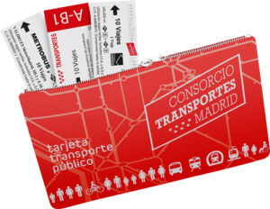
In 2017 Metro Madrid replaced the traditional paper tickets with the “Multi” card. The “Multi” card is a non-personal, reloadable, contactless public transport card with a validity of ten years, that is used to contain non-personal transport passes for the Community of Madrid’s public transport service system. The “Multi” card may hold up to three non-personal tickets.
Brief and problem statement
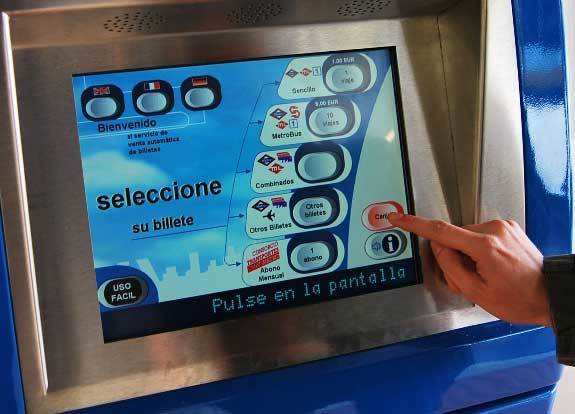
Interactions with automatic machines are not user-friendly for both casual users and tourists. The usability and understanding of the screens is unclear leading users to ask for help from the staff or lose a lot of time to reach their goal creating huge queues behind them.
Goals and requirements
The main goal is to redesign the current interface following all the principles of usability by simplifying the understanding of the content by reorganizing the current information and interactions.
The project
Understanding the problems and the challenge to tackle in this project has been very stimulating.
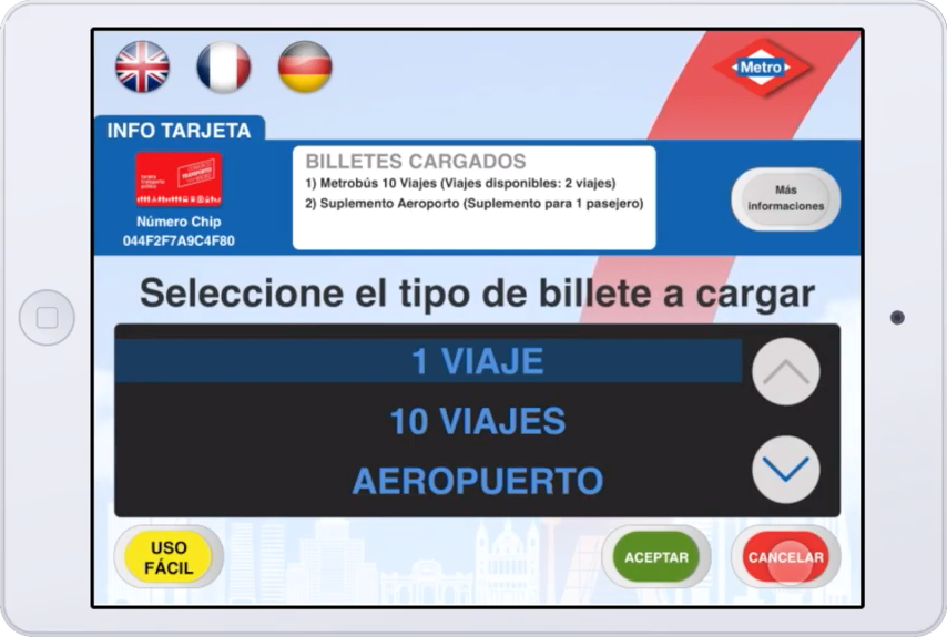
Since this card has been on the market I have studied the user interface and the user experience of the automatic machines in different stations (Airport, Sol, Avenida de America) to check how it works. Depending on the station, it’s possible to buy different kinds of tickets for light rail or suburban railway.
I decided to concentrate specifically on the ux and interface of the tickets available for the “Multi” card purchase for Zone A.
While using the ticket application I noticed many different problems, both during the interactions with the application and with the understanding of the graphical interface (check out the video at the end of this page).
The first step of the project has been to observe people interacting with the system. I noticed a lot of frustration especially among tourists who were interacting with the application for the first time. I prepared questions and interviewed about ten travelers to get a deeper understanding of their problems and feelings while using it.
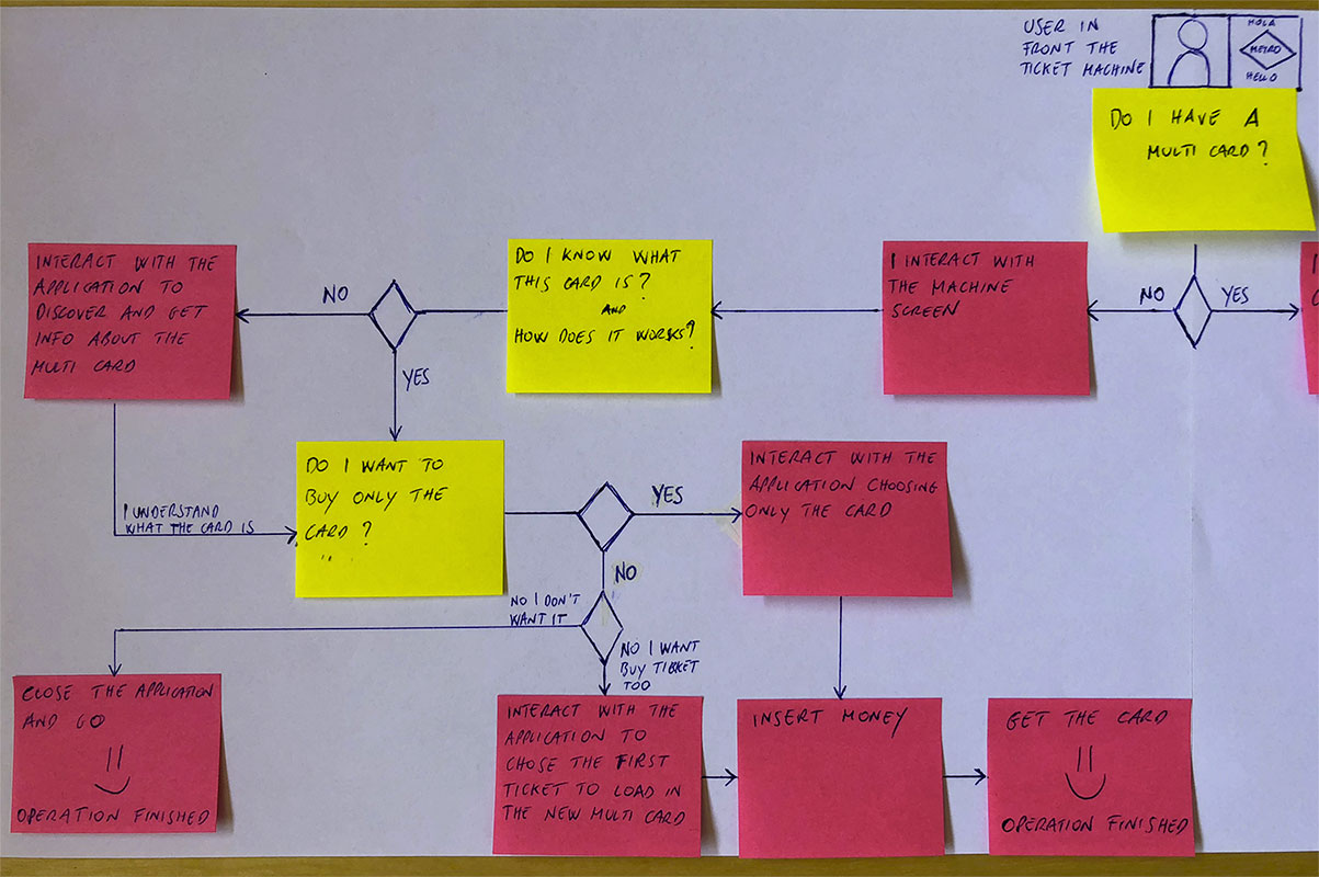
I don’t know the original Information Architecture but I tried to design the user flow trying to show the interactions with the system mapping all the available options to help the user get the info and make the right choice.
Sketches and visual design
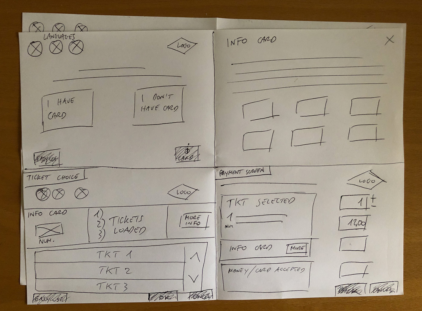
First sketches
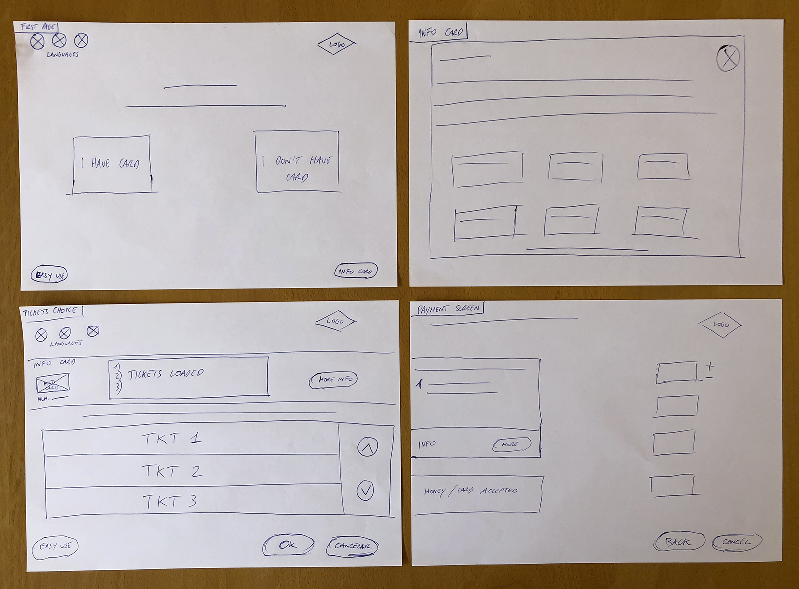
Screen drawing
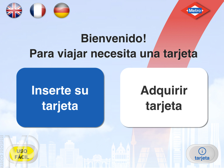
Start interface
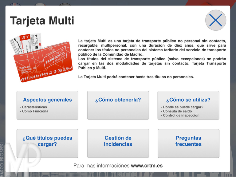
Info interface
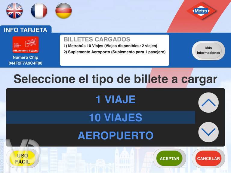
List of tickets interface
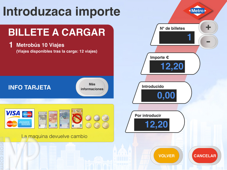
Payment interface
The final design
Designing even a small part of the system has been challenging, but I understood the needs of the users well through observations and conversations.
I downloaded the prototype on an iPad and practiced usability testing to see if the new interface proposal was understandable and functional.
Six people were interviewed, three of them had never used the ticketing system.
The results have been positive, I collected more information to improve even more the whole user experience.
MY ROLE
User Research
Sketching
Wireframing
Visual Design
User Test
PLATFORM
Totem/Kiosk system
YEAR
2018