
Case Study
Craigslist
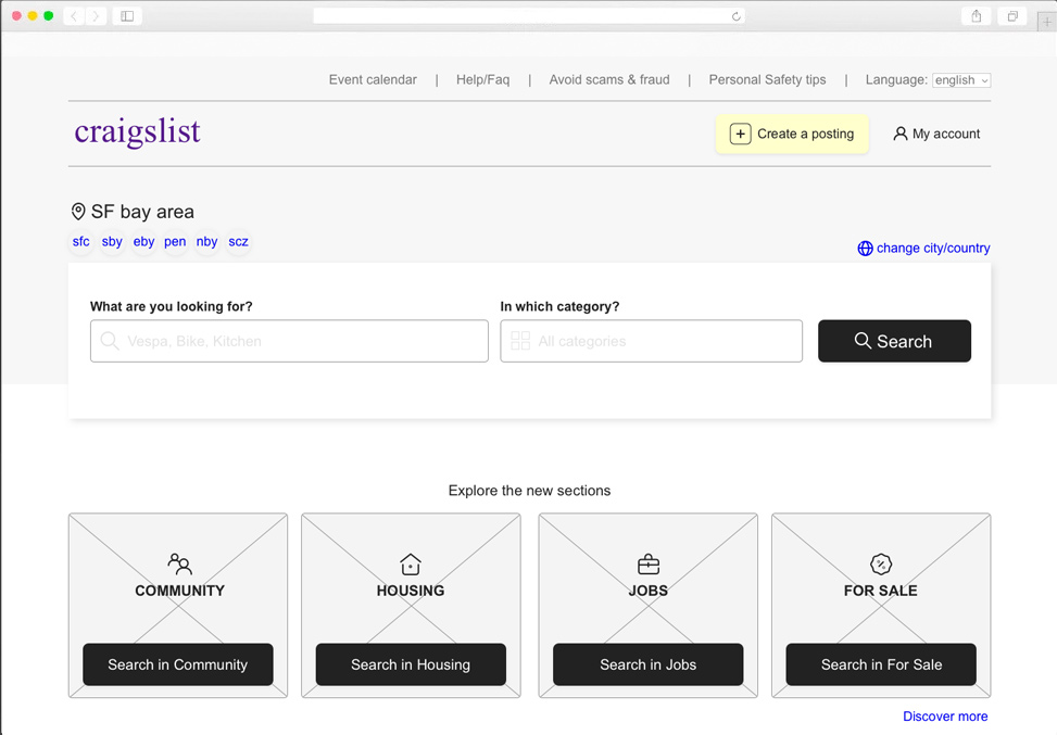
Brief and problem statement
Craigslist’s problem is quite obvious. The initial impact of the homepage is very confusing, the number of items on the home reaches almost 200 links. The search field is too small and not very visible and also there is no menu for the most relevant pages. No hierarchy of content and colors.
Goals and requirements
The goal is to reduce the cognitive load by showing few categories that group in lists all the elements of the home page. Also highlight the search field to help the user to search quickly without browsing the categories.
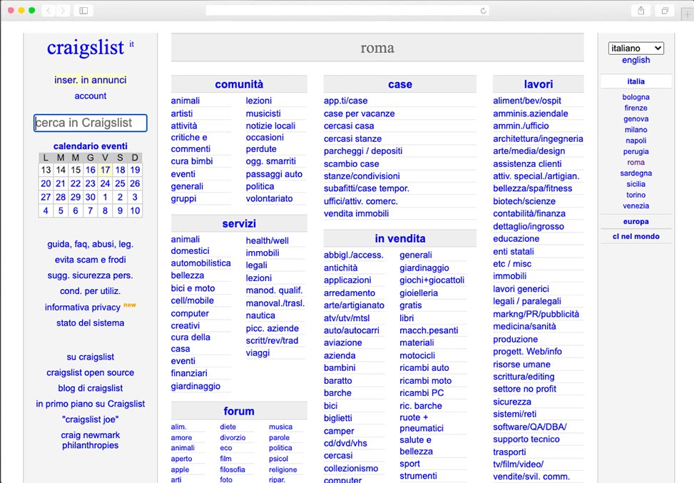
The process
I followed design thinking approach to research the needs of current users and gather as much information as possible to improve the interface and interactions with Craigslist. Unfortunately, since I didn’t have the opportunity to interview Craigslist users, I relied on online research.
After defining the problems and personas I began to ideate to create a new user experience that is useful, desirable and user friendly. For the successful design of an efficient and user-friendly interface I create different wireframes settings graphical elements and interviewing a couple of friends to see how they react.
I didn’t pursue the creation of a high-fidelity prototype because my goal was to create the best information architecture to improve comprehension of the categories and entries listed.
The final design
The interface design I proposed was guided by the principles of human-centered design and the heuristic principles I followed to create a usable and easy to understand interface.
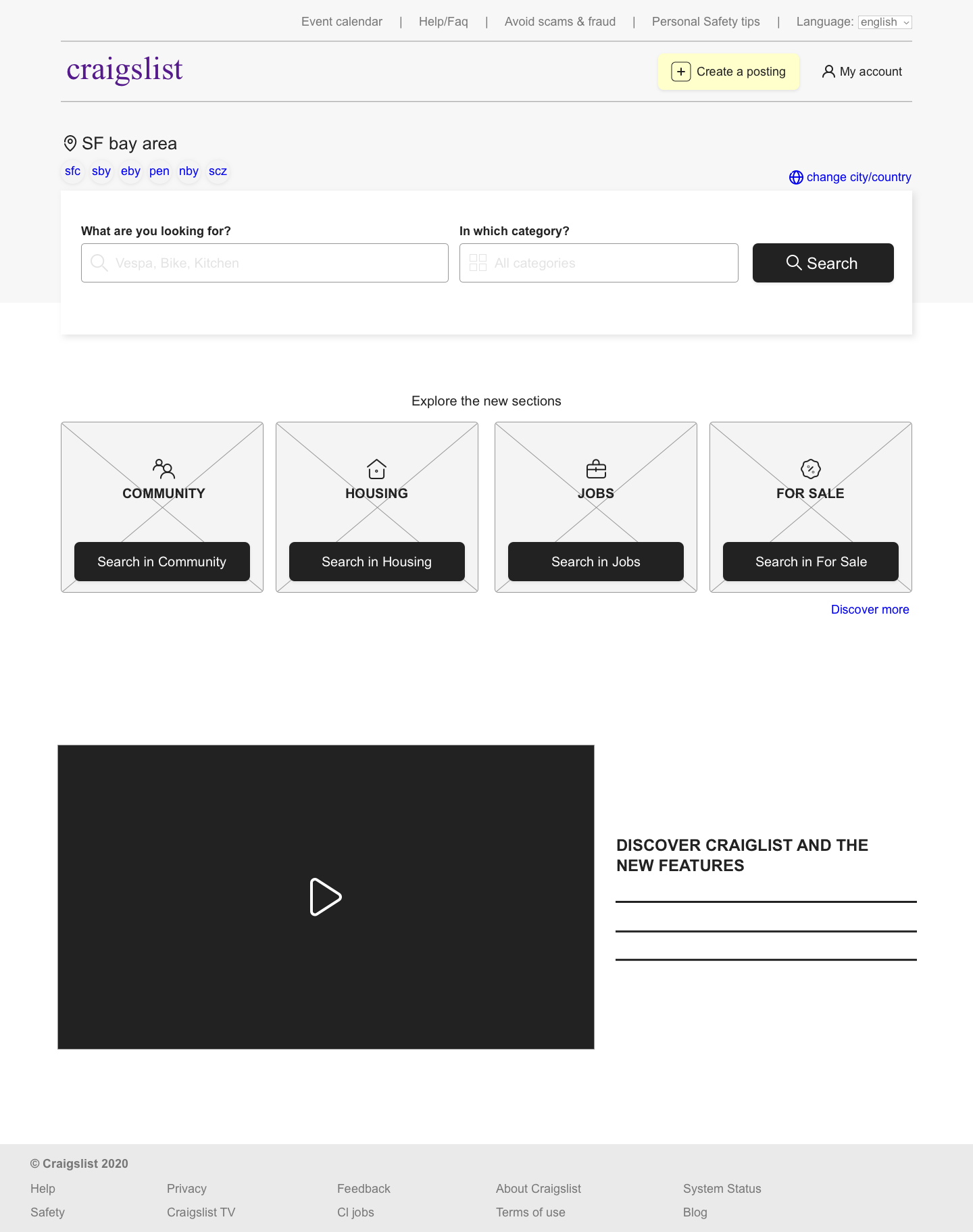
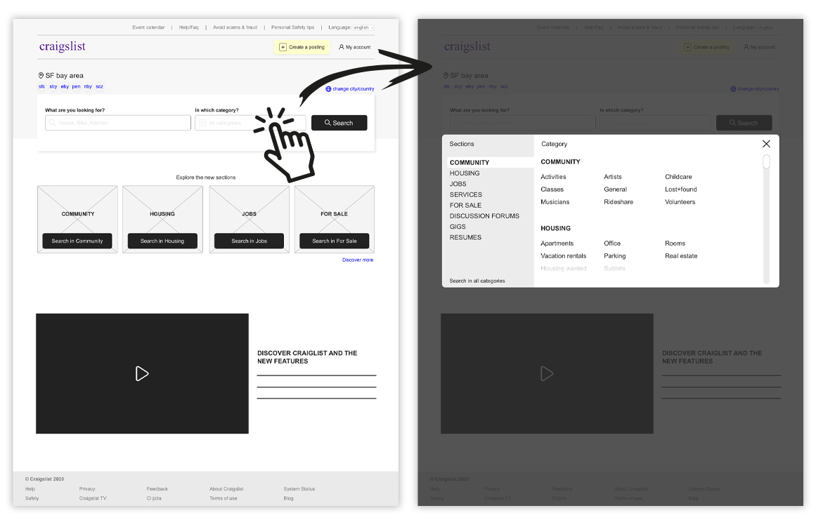
Category links have been removed from the main page and reduced so as not to overload the user’s cognitive memory. Small icons have been inserted to refer to the real world and strengthen the written message in comprehension.
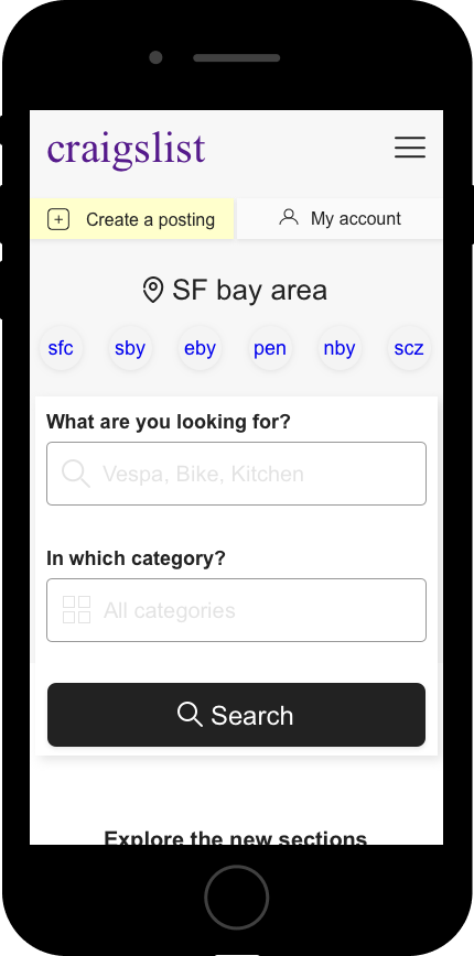
A hierarchy between sections and texts has been created by calculating the size of interactive objects, adapting them for mobile navigation and preventing possible errors.
The interface is completely efficient thanks to the reduction of words (links) and to the information architecture that better divides both content and areas, so that the user can navigate faster and more understandable.
In terms of colors, grids, typography and all interface components, it is also necessary to study the documentation and guidelines of the brand identity.
Mobile & Desktop interactions
MY ROLE
User Research
Sketching
Wireframing
PLATFORM
Desktop
Mobile
(Web)
YEAR
2020